import bindcurve as bc
import pandas as pd
import matplotlib.pyplot as pltFitting Kd from exact models
In this tutorial, we will use the exact models implemented in bindcurve to obtain \(K_d\) from direct and competitive binding experimental data. We will simulate a workflow that could conveniently be used for example in fluorescence-based or fluorescence polarization-based assays, or any other assays for which these models are suitable. We will first determine the \(K^*_d\) (Kds, the dissociation constant of the labeled ligand) by fitting data from direct binding experiment (saturation experiment) and then we will determine \(K_d\) (Kd, the dissociation constant of the unlabeled ligand) for a series of inhibitors by fitting data from competitive binding experiments.
Preparations
First, let’s import everything we will need for this workflow:
The following settings adjust the decimals and display width for pandas. This is just for display purposes, all numbers will still be stored with many decimal places.
pd.set_option("display.precision", 3)
pd.set_option('display.width', 200)
Direct binding
To begin, let’s first load the data and print the preprocessed DataFrame. We will use data from /tutorials/examples/direct.csv.
input_data_direct = bc.load_csv("examples/direct.csv")
print(input_data_direct)
Loading data from examples/direct.csv
compound c log c n_reps rep1 rep2 rep3 rep4 median SD SEM
0 probe 3.000e+00 0.477 4 132 130 130 136 131.0 2.828 1.414
1 probe 1.200e+00 0.079 4 129 130 131 133 130.5 1.708 0.854
2 probe 4.800e-01 -0.319 4 129 130 126 130 129.5 1.893 0.946
3 probe 1.920e-01 -0.717 4 120 126 121 121 121.0 2.708 1.354
4 probe 7.680e-02 -1.115 4 106 103 106 107 106.0 1.732 0.866
5 probe 3.072e-02 -1.513 4 83 85 89 81 84.0 3.416 1.708
6 probe 1.229e-02 -1.911 4 59 64 61 62 61.5 2.082 1.041
7 probe 4.915e-03 -2.308 4 36 38 38 39 38.0 1.258 0.629
8 probe 1.966e-03 -2.706 4 31 33 34 36 33.5 2.082 1.041
9 probe 7.864e-04 -3.104 4 26 28 32 33 30.0 3.304 1.652
10 probe 3.146e-04 -3.502 4 25 32 30 28 29.0 2.986 1.493For the sake of this tutorial, we will fit two models for direct binding. The dir_simple model is a simplified model which assumes no receptor depletion, and dir_specific is an exact quadratic model for direct binding. We will fit these models using the fit_Kd_direct function and print the DataFrame with results. As you can see, both models provide quite similar results and the fitted values of Kds are very close.
LsT = 0.015       # Define total concentration of the labeled ligand

# Fit the simplified model
results_direct_simple = bc.fit_Kd_direct(input_data_direct, model="dir_simple", LsT=None)
print(results_direct_simple)

# Fit the quadratic model
results_direct = bc.fit_Kd_direct(input_data_direct, model="dir_specific", LsT=LsT)
print(results_direct)
Fitting dir_simple ...
compound n_points Kds loCL upCL SE model ymin ymax Chi^2 R^2
0 probe 44 0.027 0.024 0.029 0.001 dir_simple 25.829 133.82 337.396 0.996
Fitting dir_specific ...
compound n_points Kds loCL upCL SE model ymin ymax LsT Chi^2 R^2
0 probe 44 0.019 0.017 0.022 0.001 dir_specific 27.382 132.289 0.015 336.049 0.996We will use the result from the dir_specific model, as this is the more accurate model of the two. We can now grab the value of Kds obtained from the dir_specific model and store it in a variable which we will call Kds_probe.
Kds_probe = results_direct[results_direct['compound'] == 'probe']['Kds'].values[0]
print("Kd of the probe is:", Kds_probe)
Kd of the probe is: 0.019393831705308173We will also compare the fitted curves for both models graphically by plotting them next to each other. In this case, the two curves are quite closely aligned.
# Initiate the plot
plt.figure(figsize=(5, 4))

# PLot the dir_simple model
bc.plot(input_data_direct, results_direct_simple, single_label="dir_simple", show_medians=False, show_errorbars=False, single_color="dodgerblue")

# PLot the dir_specific model
bc.plot(input_data_direct, results_direct, single_label="dir_specific", show_medians=False, show_errorbars=False, single_color="tomato")

plt.title("Direct binding")
plt.xlabel(r"[Receptor] $\mu$M")
plt.ylabel("Response")
plt.xscale("log")
plt.legend()
plt.show()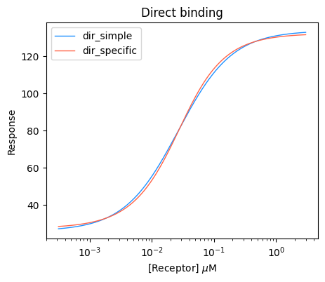
We can also plot just one of the models and customize the plot a little bit. For example, let’s plot a marker for the Kds value using the plot_value function, and also dashed traces using the plot_traces function. For clarity, we will also hide the median values by show_medians=False
# Initiate the plot
plt.figure(figsize=(5, 4))

# Plot the actual curve
bc.plot(input_data_direct, results_direct, single_label="dir_specific", single_color="tomato", show_medians=False)

# Plot the annotated marker
bc.plot_value(results_direct, value="Kds", color="black", marker="o", label="$K_d$", post_text=r" $\mu$M", decimals=3, xoffset=0.04)

# Plot the traces
bc.plot_traces(results_direct, value="Kds", kind="partial")

plt.title("Direct binding")
plt.xlabel(r"[Receptor] $\mu$M")
plt.ylabel("Response")
plt.ylim(20)
plt.xscale("log")
plt.legend()
plt.show()
Plotting marker for x value 0.019393831705308173
Plotting trace for x value 0.019393831705308173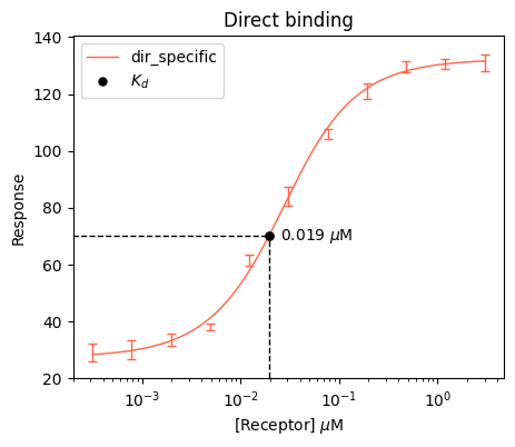
Competitive binding
Once we have obtained the value of Kds (dissociation constant of the labeled ligand) from direct binding experiment, we can proceed to fit the competitive binding data, where the labeled ligand was displaced by the unlabeled ligand. First, let’s load our data from competitive experiments into out input DataFrame. You can find the data at /tutorials/examples/competitive.csv. To save space, this time we will not print the whole DataFrame, but just the beginning, we can use the head() method in pandas.
input_data_competition = bc.load_csv("examples/competitive.csv")
print(input_data_competition.head())
Loading data from examples/competitive.csv
compound c log c n_reps r1 r2 r3 r4 r5 r6 median SD SEM
0 comp1 2000.0 3.301 6 28 26 29 27 27 25 27.0 1.414 0.577
1 comp1 1000.0 3.000 6 30 28 30 28 32 32 30.0 1.789 0.730
2 comp1 250.0 2.398 6 37 40 37 41 42 38 39.0 2.137 0.872
3 comp1 60.0 1.778 6 60 58 54 58 53 57 57.5 2.658 1.085
4 comp1 15.0 1.176 6 82 84 78 85 84 85 84.0 2.683 1.095Let’s also print what compounds do we have in our data for competitive binding.
compounds = input_data_competition["compound"].unique()
print("Detected compounds:", compounds)
print("No of compounds:", len(compounds))
Detected compounds: ['comp1' 'comp2' 'comp3' 'comp4' 'comp5' 'comp6']
No of compounds: 6Next, we can proceed to define the known experimental constants RT, LsT and Kds. For Kds, we will use the value stored in the Kds_probe variable which we obtained earlier from fitting the direct binding model. Then we will use the fit_Kd_competition function to fit the comp_3st_specific model, and print the results.
RT = 0.05           # Total concentration of the receptor
LsT = 0.005         # Total concentration of the labeled ligand
Kds = Kds_probe     # Dissociation constant of the labeled ligand

results_competition = bc.fit_Kd_competition(input_data_competition, model="comp_3st_specific", RT=RT, LsT=LsT, Kds=Kds)
print(results_competition)
Fitting comp_3st_specific ...
compound n_points Kd loCL upCL SE model ymin ymax RT LsT Kds Chi^2 R^2
0 comp1 54 11.437 9.839 13.301 0.822 comp_3st_specific 26.693 134.487 0.05 0.005 0.019 537.472 0.990
1 comp2 54 2.851 2.417 3.364 0.234 comp_3st_specific 26.828 132.026 0.05 0.005 0.019 705.520 0.986
2 comp3 54 0.610 0.502 0.740 0.057 comp_3st_specific 23.724 136.476 0.05 0.005 0.019 908.705 0.982
3 comp4 54 1.042 0.861 1.260 0.099 comp_3st_specific 24.220 138.923 0.05 0.005 0.019 1024.489 0.982
4 comp5 54 9.126 7.510 11.082 0.891 comp_3st_specific 25.638 132.209 0.05 0.005 0.019 929.856 0.982
5 comp6 54 2.510 2.143 2.942 0.198 comp_3st_specific 23.731 132.746 0.05 0.005 0.019 664.941 0.988We can also get the results as formatted report using the report function. The last line of code will copy this report to your clipboard, so that you can paste it anywhere you want.
results_competition_report = bc.report(results_competition, decimals=1)
print(results_competition_report)
results_competition_report.to_clipboard(excel=True, sep=",")
compound Mean (95% CI) Mean ± SE
0 comp1 11.4 (9.8, 13.3) 11.4 ± 0.8
1 comp2 2.9 (2.4, 3.4) 2.9 ± 0.2
2 comp3 0.6 (0.5, 0.7) 0.6 ± 0.1
3 comp4 1.0 (0.9, 1.3) 1.0 ± 0.1
4 comp5 9.1 (7.5, 11.1) 9.1 ± 0.9
5 comp6 2.5 (2.1, 2.9) 2.5 ± 0.2Finally, we can plot the results. Let’s just use default settings for the plot function this time and plot all the compounds.
# Initiate the plot
plt.figure(figsize=(5, 4))

# Plot the actual curve
bc.plot(input_data_competition, results_competition)

# Provide other matplotlib settings
plt.title("Competitive binding")
plt.xlabel(r"[Ligand] $\mu$M")
plt.ylabel("Response")
plt.xscale("log")
plt.legend()

# Show the plot
plt.show()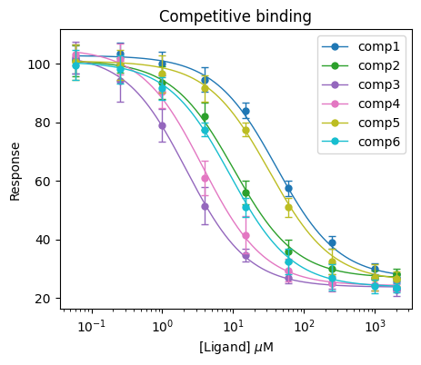
If you want to plot just a selection of compounds, you can use the compound_sel argument. The following example will plot only the comp1 compound.
plt.figure(figsize=(5, 4))

bc.plot(input_data_competition, results_competition, compound_sel=["comp1"], single_color="dodgerblue")

plt.title("Plotting selection")
plt.xlabel(r"[Ligand] $\mu$M")
plt.ylabel("Response")
plt.xscale("log")
plt.legend()
plt.show()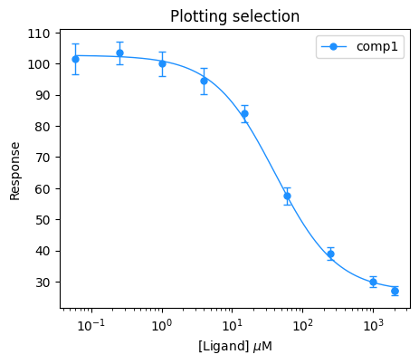
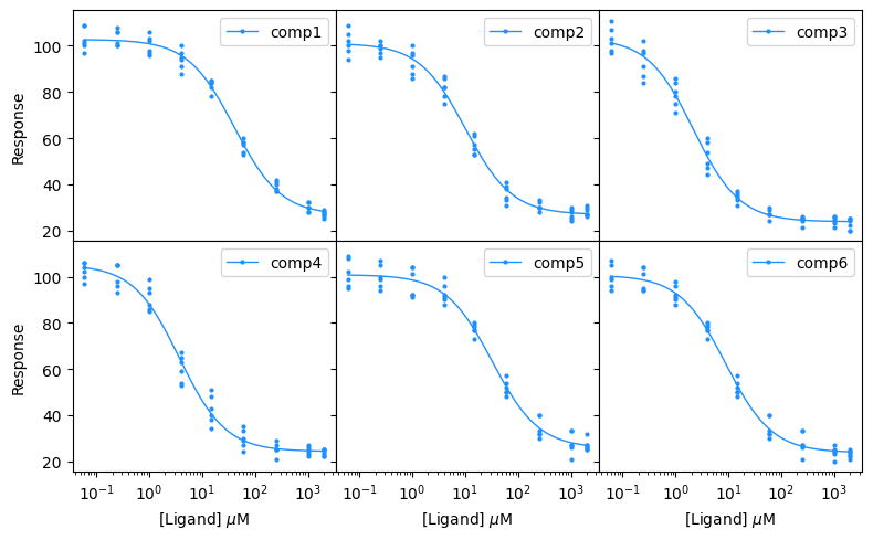
You can also plot the compounds on a grid using the plot_grid function. In this example, we will customize the grid by hiding the medians and errorbars, showing all the data points, and setting hspace and wspace arguments to 0 so that there is no space between the subplots. This formatting can be used to produce neat, space-saving figure for your document.
bc.plot_grid(input_data_competition,
             results_competition,
             n_cols=3,
             figsize=(8,5),
             single_color="dodgerblue",
             show_title=False,
             show_legend=True,
             show_all_data=True,
             show_medians=False,
             show_errorbars=False,
             markersize=2,
             hspace=0,
             wspace=0,
             show_inner_ticklabels=False,
             x_label=r"[Ligand] $\mu$M",
             y_label="Response")