Plotting and reporting#
This tutorial turns fitted IC₅₀ results into compact tables and diagnostic figures. Plotting is Axes-first: create Matplotlib axes, then ask bindcurve to draw into them.
import matplotlib.pyplot as plt

import bindcurve as bc
all_data = bc.DoseResponseData.from_csv(
    "data/competitive-binding.csv",
    format="wide",
)
data = all_data.keep_only(["ic50_a", "ic50_b"])
results = bc.fit(
    data,
    model="ic50",
    fixed={"ymin": 5.0, "ymax": 95.0},
)
Summary and manuscript-ready report#
summary() exposes numerical statistics, while report() formats a selected concentration parameter for direct use in a report or manuscript.
results.summary()[
    ["compound_id", "N_exp", "N_fit_successful", "IC50", "IC50_SD_lower", "IC50_SD_upper"]
]
| compound_id | N_exp | N_fit_successful | IC50 | IC50_SD_lower | IC50_SD_upper | |
|---|---|---|---|---|---|---|
| 0 | ic50_a | 2 | 2 | 0.029872 | 0.027723 | 0.032187 |
| 1 | ic50_b | 2 | 2 | 0.297373 | 0.271715 | 0.325455 |
results.report(unit="concentration units", include_n_exp=True)
| compound_id | report | N_fit_successful | N_fit_failed | |
|---|---|---|---|---|
| 0 | ic50_a | 0.030 [0.03, 0.03] concentration units, N_exp = 2 | 2 | 0 |
| 1 | ic50_b | 0.30 [0.3, 0.3] concentration units, N_exp = 2 | 2 | 0 |
Individual experiments with confidence bands#
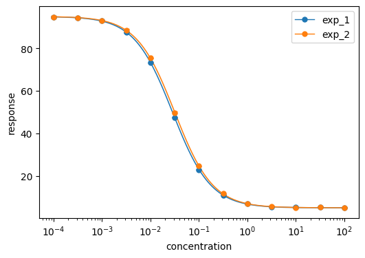
plot_fits() draws one curve per independent experiment. Confidence bands are pointwise intervals derived from each fit covariance matrix.
fig, ax = plt.subplots(figsize=(6, 4))
bc.plot_fits(
    data,
    results,
    compounds="ic50_a",
    confidence_band=True,
    ax=ax,
)
ax.set_xlabel("concentration")
ax.set_ylabel("response")
ax.legend()
plt.show()
Compound summaries#
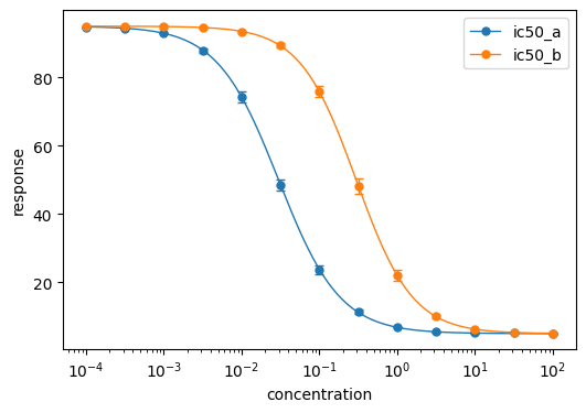
plot_compounds() combines experiments into one visual series per compound and shows inter-experiment variation with error bars.
fig, ax = plt.subplots(figsize=(6, 4))
bc.plot_compounds(data, results, ax=ax, errorbar_kind="sd")
ax.set_xlabel("concentration")
ax.set_ylabel("response")
ax.legend()
plt.show()
Residuals#
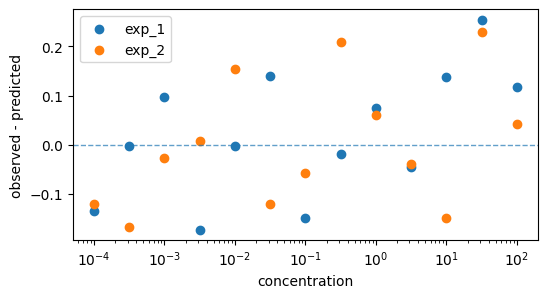
Residual plots reveal concentration-dependent structure that a summary statistic can hide.
fig, ax = plt.subplots(figsize=(6, 3))
bc.plot_residuals(data, results, compound_id="ic50_a", ax=ax)
ax.set_xlabel("concentration")
ax.set_ylabel("observed - predicted")
ax.legend()
plt.show()